|
If you hadn't been here in a while, you'll notice that I posted She-Captain, all 13 pages. This was done early last year, but I had neglected posting it.
I think the idea behind it and the script are both pretty good. After a few projects under my belt, I realize that my comedy really isn't my strong suit; I'm much more drawn to dramatic stories. However, besides my natural weakness for comedy, I've also noticed that my storytelling is a little off in some places. Some pages are good, but some are pretty terrible. I also think a good colorist could really improve on it since my own coloring really doesn't help. Nevertheless, another finished project. I'm not going back and revising it, even though I already see some quick improvement could be done through some panels redrawing and quick color changes. It was the best I could do at the time.
0 Comments
One of the things I enjoy about blog posts, which I don't write nearly enough of, is the opportunity to write about process and not necessarily final product. Below is a discarded page, a prior version of page 10 of the book. I needed this page to say more than just what the word balloons offered. I wanted it to feel like a life remembered; a blur of big moments and little moments that had somehow stuck with you for some reason. For Hollis, I imagined some of these moments (none of this is really in the story): the time his dad took him to a ball game, or leaving home for the first time. There was the time he got terminated from the Rocket Company and there was that time when he didn't talk to the girl he may have liked when he had the chance. I liked the idea a lot, but I realized that it just wasn't as effective as it could be. Basically I was packing too many disconnected images that were all detracting from each other. And even worse, by the time the pages were all pencilled, I realized that this just didn't flow. The panels in the bottom right got lost and there wasn't a visual force toward the bottom right corner of the page which is where the panels were going. The page had to go. Here it is. 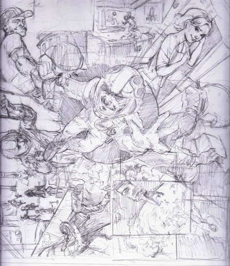 So I came up with this new page 10. With the large black shapes in the lower left, I took out the busy-ness of that part of the page and now the eye can flow from the middle down toward the right. These are things that sequential artists have to learn, and even if throwing away a page isn't optimal, the story is always the most important thing. I found this line much earlier in the text about "life being so short, over before you took a breath," and I knew I'd have to put it somewhere. thought it'd be great to illustrate that more lyrically with the smoke in this page. What do you think? 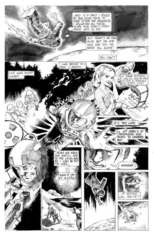 Here is the last page from my adaptation of Ray Bradbury's Kaleidoscope. When I first started the project, the objective was always to get to these final two pages. This was the payoff that I had to work toward. Honestly, looking at it now, I think the skill is there, but my adaptation doesn't add anything to the original story. In fact, I still think this story works much better in text. Nevertheless, these two pages are, I think, the two best pages of my adaptation. If anything, these two pages break up the story into images and lines where I can make the reader read the story the same way I did.   |
Brandt WongThis blog shows the progress and describes my thoughts on my most recent project(s). Archives
September 2019
Categories |
 RSS Feed
