|
This isn't a post; more of an announcement.
I'm back to studying for actuarial exams after deciding that being a board artist is probably not in the cards in the near future. I don't want to be extreme and say I'm never doing it again, but I'm starting to question if it's worth it/if I'll ever make it. I'll still keep up drawing, maybe even doing a couple side projects. Maybe even take another online class. I still love to do it, but it might not be the best option when I could get another more reliable career started. It's tough because I know that for most people, they've just seen my graphic novel and it seems like I'm just getting started. This should be the time when I should be continuing the push, continuing to put new work out there and remind people that I'm trying to pursue this. And right when this journey appears to get "started," I'm actually ending. I need to remember that this is not the end; it is a comma and not a period. But I can walk away knowing that I spent the last nine months trying to get better, and I did just that. Maybe I didn't shoot into the stratosphere as a new Disney hire, but I'm starting to realize that that was highly unrealistic to expect. Not being a professional doesn't mean I have to stop loving it all either. Back to studying! And signing off. Temporarily.
0 Comments
In between work, I've done these warmups. I know I should work with line, but my time drawing in college always made me admire tonal drawing. There is never a shortage of Audrey pics to draw from. 

So far, I've gotten positive feedback about my graphic novel, and it's been nice to hear kind words after the hundreds of hours I put into it. Still waiting to get the first copy from LithoNinja and I hope the print is good!
One of the comments I got was that my art looks very different from my boards to my book, both in aesthetic and quality. When i step back and try to look objectively, it's not hard to see that. While I do want to remain critical, I have to admit that the book I made is the best thing I've done. That is a level that I can reach, not just in finished product, but in effort. If I can push with the same dogged persistence that I did there to make my board drawings and my cuts work, I CAN be a professional board artist. I need to hold myself to that standard of effort, where I am willing to redo panels, redraw poses, faces, figures, everything to make it right. I'm confused as to what I should do next. I'm going to board a few scripts, and I'm excited about the new challenge of making these boards as good as I can make them. Here's to revamping my whole boarding portfolio in the next month! It's always fun to get back to just copying stuff. Here's a copy of a photo of Audrey from Roman Holiday. I think it looks best on this paper to be really selective in the use of whites on the paper, in this case, mostly her nightgown and the drapes in front of her. I've done other sketches where I used way too much white and made it look like a mess. I never get tired of drawing Audrey's face and I still have a huge collection of photos to get to! I should really work harder on the hair though... 
Not much different from the original sketch. I just copied the image a couple of times, manipulated with Channel Mixer to get some color splashed on, and then painted over the sunflower and got some highlights on the figure. I really like that you can see the marker still; painting with Photoshop, no matter how good the brushes, can't perfectly replicate hand drawn media.
I want the color scheme to show a dying Sun, so maybe I should push the more burnt oranges on the edges? Maybe a little more work still to be done... Addendum: So the first one I did is the one on the right, but I think I'm going with the one on the left. I really like the reds and I dig the more monochromatic look. I also framed it a little differently, but I think it's better this way. Needed an illustration just to decorate the cover interior. I just found Greg Ruth's work, sort of late considering I follow Muddy Colors and he's one of the regular contributors. His work is wonderfully evocative and emotional, and I thought that it would be a great style for this last piece. If I were to do this project again, I might go for something closer to Ruth's style. I tried to emulate his dry brush technique, but it was pretty hard; my brush pen seemed to never give out the scratchy, rough quality I wanted, even when I took out the ink cartridge. But all in all, I'm happy with the result. 
Almost all of the pages are in color now. And while I'm happy about how much I've worked on all this, I realize that my pages could have been laid out better and thought through more for panels to lead into other panels. Composition and perspective could have been more interesting, but it's been very fulfilling to work on this. I'm going to download Comic Life and pop in the dialogue and captions. If anyone knows of a better program, let me know!
I have to design my cover now, what should I do? I didn't realize I had to design the interior cover pages, but I think I'll just pop in some sketches or something. This is one of my book's important pages, where Margot gets locked in a closet. I can't seem to figure out if it's working or not color wise. I wanted the color to escalate, and so far, after much head scratching, this is where I'm at. Maybe this is where it will end up... 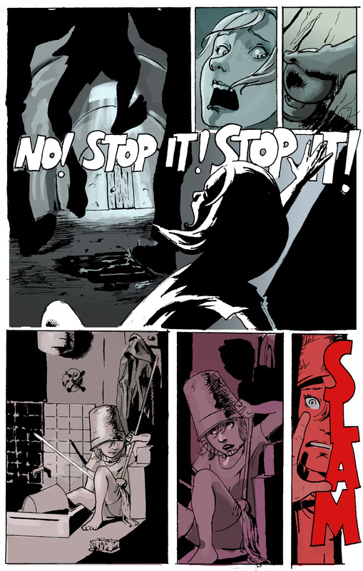
I just added a couple more mostly colored pages into the graphic novel section. I didn't have very clear ideas at first about the sunlight two page spread; I just knew that after seeing subdued color the entire book, I wanted to give the reader a sense of the Sun flashing in their eyes as well. At the same time, I was hoping to give the feeling of the urgency and the limited time the children have by making a color progression from panel to panel. After compiling a lot of photo reference, I used a technique that I learned on a concept art demo video I saw on youtube: I popped in the pictures whose color schemes matched what I wanted, stretched them around and mixed and matched until I got a better sense of the colors, and then painted over all of that.
I knew coloring would be hard, but by using more reference, it has been made a manageable task. All pages should be colored soon, and then on to lettering the whole thing. Phew! |
Brandt WongThis blog shows the progress and describes my thoughts on my most recent project(s). Archives
September 2019
Categories |


 RSS Feed
